Orbital
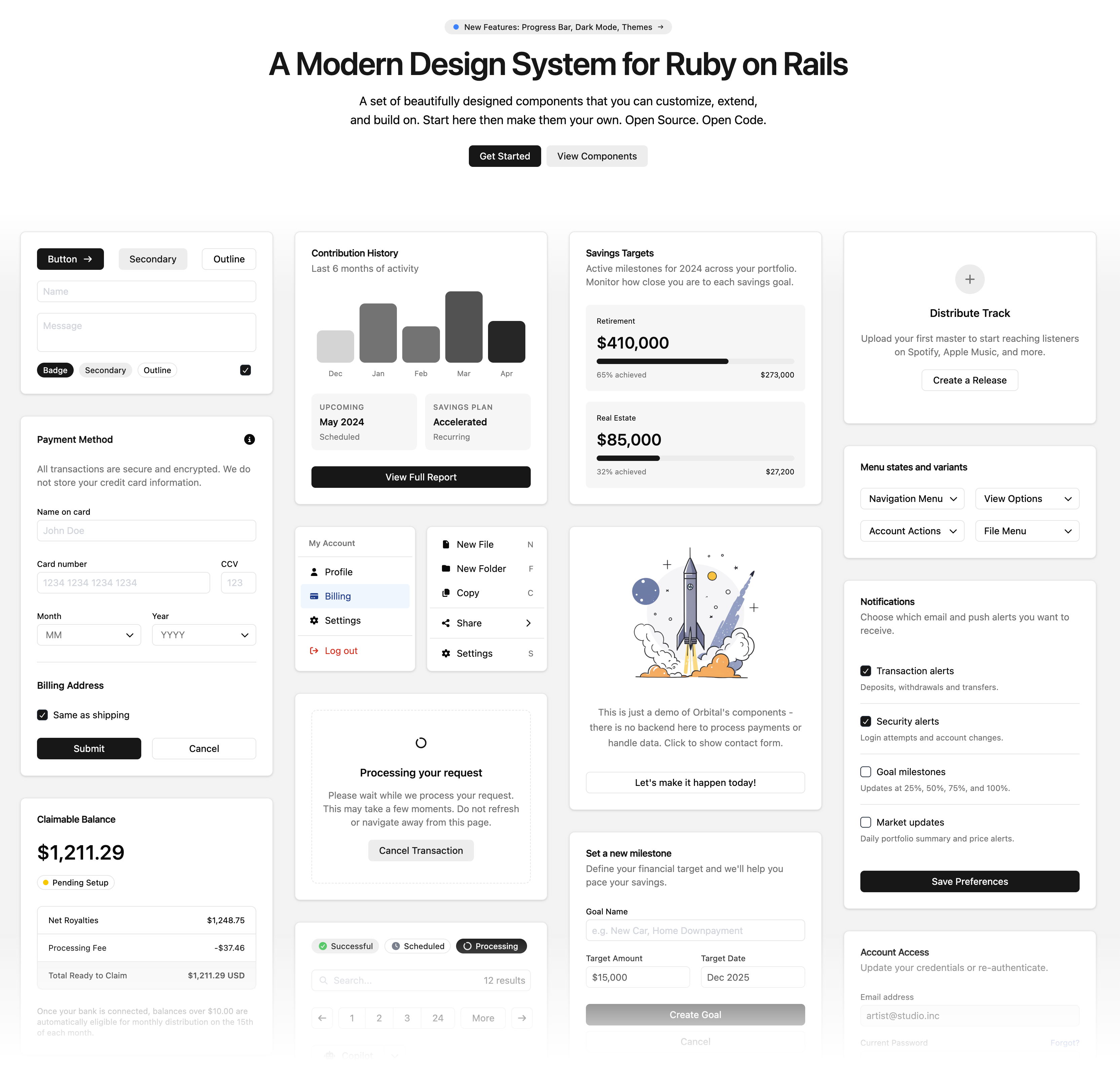
A modern design system and component library for Ruby on Rails, built with ViewComponent, the ORB Template Language and Tailwind CSS v4. Ship polished interfaces without leaving Rails.
- Themable: customize colors, typography and spacing with CSS variables
- Dark mode: built in, using a class toggle
- Accessible: components follow accessibility best practices
Installation
Add the gem and run its install generator:
bundle add orbital_ui
bin/rails generate orbital_ui:install
The gem is named orbital_ui because the Orbital gem on rubygems.org is an unrelated project.
Orbital requires Ruby 3.4 or newer and Rails 7.1 or newer.
The generator is safe to run again, and it does the following:
-
ORB.namespaces: addsORB.namespaces += %w[OrbitalUi]toconfig/initializers/orb.rb. Every app needs this, even if its own views only use ERB, because Orbital's templates use it to find each other. Without it, components such asAlert,Dialog,SelectandSpinnerraise aNameError. -
Layout: adds Orbital's stylesheet and JavaScript to your layout, before your own stylesheet. If it can't find a place for them, it prints the tags instead. In a
-c tailwindapp, it also changesstylesheet_link_tag :appto"application", because:applinks your raw Tailwind sources, whose imports fail in the browser. It also adds adialogsTurbo Frame for dialogs loaded from the server. -
Tailwind theme: in a
-c tailwindapp, writesapp/assets/stylesheets/orbital_ui.tailwind.cssand imports it. See Using with Tailwind.
Orbital works in apps created with rails new -j bun -c tailwind, the expected setup, and with -c sass.
Usage
Use components in your views:
<%= render OrbitalUi::Button.new(variant: :primary) do %>
  Click me
<% end %>
In ORB templates, use components as tags:
<Button variant="outline" class="w-full">Full Width</Button>
<Card class="border-primary">Highlighted Card</Card>
Every component accepts a class attribute for one-off adjustments.
Form wraps form_with, and fills each field's name, value, label and validation error from the model:
<Form model={@account}>
  <Form:TextField name="email"/>
  <Form:Select name="plan" options={plans}/>
  <Form:Submit>Save</Form:Submit>
</Form>
Demo
demos/fernhill is a personal finance dashboard for a made-up company, built with Orbital in a standard Rails app. To run it, use make demo, then open http://localhost:3000.
Components
Layout & Structure
- Accordion: Collapsible content sections with keyboard navigation
- Card: Content containers with optional header and footer slots
- Expander: Flexible spacer for distributing space in flex layouts
- Grid: CSS Grid container with column and span control
- Inline Stack: Horizontal flex container with spacing and alignment
- Separator: Horizontal or vertical dividers between content sections
- Stack: Vertical flex container with spacing and alignment
Navigation
- Navigation Menu: Responsive site navigation with mobile drawer
- Dropdown: Trigger/content pattern for menus and popovers
- Menu: Structured menu with items, labels, separators, and submenus
Data Display
- Avatar: User avatars with initials or Gravatar integration
- Badge: Small status indicators and labels
- Icon: Inline SVG icons from Lucide and Font Awesome brands, with size variants
-
Image: Images from the asset pipeline (
asset) or a URL (src) - Kbd: Keyboard shortcut display
- Progress Bar: Horizontal bar with value/max fill calculation
- Spinner: Loading indicators
- Tooltip: Contextual information on hover
Typography
- Heading: Semantic headings with size scale (xs–4xl)
- Text: Body text with size, weight, tone, and alignment control
- Prose: Long-form content styling
- Typography: Display type for marketing pages
Forms
- Button: Primary, secondary, outline, ghost, and destructive variants
- Button Group: Visually connected button sets
- Check Box: Toggle inputs with labels and help text
- Select: Custom dropdown select with search
- Text Field: Inputs and textareas with icons, prefix/suffix, and validation
Feedback
- Alert: Contextual messages with tone variants
- Dialog: Modal dialogs with header, body, and footer
- Confirmation Dialog: Confirm/cancel pattern
- Delete Dialog: Destructive action confirmation
Overlay
- Modal: Full-screen overlay container
- Popcard: Hover card previews
- Popover: Anchored floating content
Theming
Orbital uses a semantic color system powered by CSS custom properties. Override any variable in a stylesheet loaded after Orbital's, outside any @layer, because Orbital's variables aren't in a layer and a layered override won't apply:
:root {
  --primary: hotpink;
  --primary-foreground: white;
  --radius: 0.25rem;
}
Colors, surfaces and radii are defined in app/assets/stylesheets/orbital_ui/theme.css. The full set includes:
-
Surfaces:
--background,--card,--popover,--muted,--accent -
Interactive:
--primary,--secondary,--destructive -
Semantic tones:
--tone-success,--tone-warning,--tone-danger,--tone-info,--tone-magic -
Borders & inputs:
--border,--input,--ring -
Typography:
--font-weight-normal,--font-weight-medium,--font-weight-semibold,--font-weight-bold,--text-body-*,--text-heading-* -
Shape:
--radius
See the theming guide and its example theme.
Dark Mode
Add the dark class to your <html> or <body> element. All theme variables swap automatically. To customize dark mode colors, override them under .dark.
Using with Tailwind
In an app created with -c tailwind, the install generator imports Orbital's theme into your Tailwind CSS:
/* app/assets/stylesheets/application.tailwind.css */
@import "tailwindcss";
@import "./orbital_ui.tailwind.css";
You can then use Orbital's colors as utilities, such as bg-primary, and dark: follows Orbital's dark class instead of the OS setting. Your build only contains the classes your app uses, and Tailwind utilities in your views can override Orbital's component styles.
Run the generator again after upgrading, so orbital_ui.tailwind.css picks up any new theme tokens.
Using with Sass
In an app created with -c sass, the generator only needs to set up the initializer and layout. Override Orbital's variables in app/assets/stylesheets/application.sass.scss. Orbital's utility classes aren't available for your own markup, because they come from your own Tailwind build.
What Orbital Changes in Your App
Orbital is a full UI kit. Its stylesheet includes Tailwind's reset, so it affects your whole app, including headings, lists and margins, whichever CSS setup you use. Your application is responsible for page layouts and backgrounds, and body text colors and fonts.
Development
The gem is at the repository root, and test/dummy is a Rails app that documents every component.
You'll need Ruby (see .ruby-version), Bun and, for the full test run, Trivy.
bin/setup   # Install dependencies and build the docs app's assets
bin/dev     # Run the docs app on http://localhost:3000, with asset watchers
make docs does both.
bin/dev rebuilds the gem's committed assets in development mode, so run make assets before committing them.
| Command | What it does |
|---|---|
make test |
RuboCop, Minitest, Trivy, bundler-audit and Brakeman |
make test-rubies |
Minitest on every supported Ruby (needs rbenv) |
make build |
Builds the .gem
|
make lint-js, make typecheck, make bun-audit
|
Biome, TypeScript and npm dependency checks |
make assets, make assets-dummy, make icons
|
Rebuild the gem's assets, the docs app's assets, or the icons |
To run the docs site in a container, see the Dockerfile.
Contributing
Bug reports and pull requests are welcome on GitHub. Everyone interacting in the project is expected to follow the code of conduct.
- Fork the repository
- Create a feature branch
- Make your changes
- Test with the docs app and
make test - Submit a pull request
License
Orbital is available as open source under the terms of the MIT License.
Third-party licenses
Orbital bundles icons from these projects. lib/orbital_ui/icons.rb lists the same notices.
Lucide is distributed under the ISC License:
Copyright (c) 2026 Lucide Icons and Contributors

Permission to use, copy, modify, and/or distribute this software for any
purpose with or without fee is hereby granted, provided that the above
copyright notice and this permission notice appear in all copies.

THE SOFTWARE IS PROVIDED "AS IS" AND THE AUTHOR DISCLAIMS ALL WARRANTIES
WITH REGARD TO THIS SOFTWARE INCLUDING ALL IMPLIED WARRANTIES OF
MERCHANTABILITY AND FITNESS. IN NO EVENT SHALL THE AUTHOR BE LIABLE FOR
ANY SPECIAL, DIRECT, INDIRECT, OR CONSEQUENTIAL DAMAGES OR ANY DAMAGES
WHATSOEVER RESULTING FROM LOSS OF USE, DATA OR PROFITS, WHETHER IN AN
ACTION OF CONTRACT, NEGLIGENCE OR OTHER TORTIOUS ACTION, ARISING OUT OF
OR IN CONNECTION WITH THE USE OR PERFORMANCE OF THIS SOFTWARE.
Feather: some Lucide icons are derived from Feather, listed in lib/orbital_ui/icons.rb. Those icons are distributed under the MIT License:
Copyright (c) 2013-present Cole Bemis

Permission is hereby granted, free of charge, to any person obtaining a copy
of this software and associated documentation files (the "Software"), to deal
in the Software without restriction, including without limitation the rights
to use, copy, modify, merge, publish, distribute, sublicense, and/or sell
copies of the Software, and to permit persons to whom the Software is
furnished to do so, subject to the following conditions:

The above copyright notice and this permission notice shall be included in all
copies or substantial portions of the Software.

THE SOFTWARE IS PROVIDED "AS IS", WITHOUT WARRANTY OF ANY KIND, EXPRESS OR
IMPLIED, INCLUDING BUT NOT LIMITED TO THE WARRANTIES OF MERCHANTABILITY,
FITNESS FOR A PARTICULAR PURPOSE AND NONINFRINGEMENT. IN NO EVENT SHALL THE
AUTHORS OR COPYRIGHT HOLDERS BE LIABLE FOR ANY CLAIM, DAMAGES OR OTHER
LIABILITY, WHETHER IN AN ACTION OF CONTRACT, TORT OR OTHERWISE, ARISING FROM,
OUT OF OR IN CONNECTION WITH THE SOFTWARE OR THE USE OR OTHER DEALINGS IN THE
SOFTWARE.
Font Awesome Free brand icons by Fonticons, Inc. are licensed under CC BY 4.0. Each icon in lib/orbital_ui/icons.rb keeps its attribution comment.